SharePoint 2013: Is utility more important than usability?
2013-02-11
Is utility more important than usability?
When evaluating SharePoint 2013 specifically as a collaboration platform, this question is often top of mind. The Metro user interface in SharePoint 2013 is a refreshing update to this mature platform, but usability goes deeper than just the front-end theme.
A good user experience is both subjective in relation to the user's own experience and situated in the context of use. For example, consider the user experience of the rich text editor in Medium (a publishing platform from the creators of Twitter):
"There’s no layer of abstraction. This is a simple (and old) concept, but I haven’t seen it in any other publishing tool—unless you count Google Docs and the like, where you’re basically always in editing mode (versus always in viewing mode). And it makes a big difference…
… One of the reasons its possible to have this really WYSIWYG experience is because we’ve stripped out a lot of the power that other online editors give you. Here are things you can’t do: change fonts, font color, font size. You can’t insert tables or use strikethrough or even underline. Here’s what you can do: bold, italics, subheads (two levels), blockquote, and links."
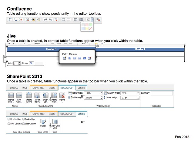
With that in mind, lets compare SharePoint 2013 in a few situations with a couple of competing products: Atlassian Confluence and Jive. I've previously showcased the different table capabilities in those platforms, so lets look at them again in more detail and also SharePoint 2013.
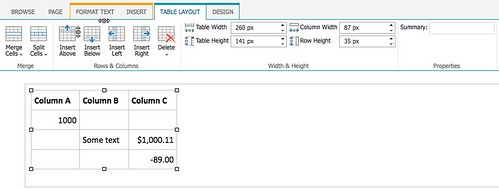
SharePoint 2013's table capabilities are quite impressive - they offer fine grained controls over formatting and even let you apply table styles, as you would find in Word and Excel.
However, the rich text editor interface is far more complex:
Of course this only represents one dimension of the user experience of creating tables in these platforms. For example:
- Confluence's table editor provides a tool to copy and paste table rows, to make it easier to organise table content. Once a table is created and publishing it can also be sorted by the person viewing the table.
- SharePoint provides a way to enter details for the 'summary' HTML attribute of table, which may help with accessibility - however, this is obsolete in HTML5.
Pasting tables from Word and Excel into a page was also not handled consistently across all three platforms - particularly when viewed through a mobile device:

Its also worth noting other differences evident in these examples, such as:
- Both Jive and Confluence display information about the author and when the table was edited. By default, the SharePoint wiki does not display this information on either mobile or Web interface.
- Its not shown in the screenshots, but if you scroll down both Jive and Confluence let you comment and like the page. Jive also lets you follow or unfollow the document or email a link to the page to someone.
So which platform offers the best user experience?
Its worth emphasising again that all three platforms are very different from each other. SharePoint can be used as a Web publishing system - this is very evident in the content editing interfaces and the default user interface. For example, if you want to create a new page of content in SharePoint it will take a minimum of 5 steps (assuming you can find the page where you want to add the new page) compared to a simple 2-3 step process in Jive and Confluence (Jive probably has the most streamlined experience of all three).
The pros and cons of each platform are difficult to ascertain without understanding the desired user experience of different users (and taking into account business requirements or constraints). All three platforms are workable, but in different situations some will be better than others.
Note: Tested using Word 2011 for Mac, Firefox and iPhone.