Comparing the usability of page creation: SharePoint 2013 versus other social intranets
2013-02-12
Yesterday I did a deep dive into the user experience of three different intranet and collaboration platforms: SharePoint 2013, Jive and Confluence. I looked specifically at how these particular products support tables in their rich text editors, because getting this right is quite tricky in a Web browser. While each product performs well overall, each also addresses the user experience quite differently. In fact, you can not really evaluate the user experience of a platform on a single feature.
SharePoint 2013 in particular has a strong web-publishing orientation and this is apparent in the user experience in some aspects of its collaboration capabilities.
One small example is SharePoint 2013's support for special characters in page titles. Out of the box, SharePoint does not allow you to create page titles that include " # % & * : < > ? \ / { } ~ | characters, because they would break human-friendly URLs. Jive and Confluence construct their page URLs differently, so you are free to use these characters.
Which approach offers the best user experience? Well, it depends on how the platform is being used.
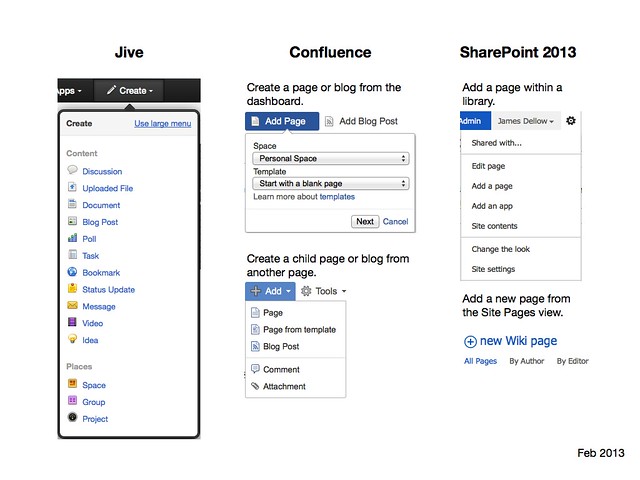
For example, another more obvious difference is the process for creating content:
- Confluence currently offers two main methods for creating content - from the dashboard (add a page or blog post to any space you can access) or from an existing page (add either a child page or new blog post). If global or space page templates exist, you can also create pages based on those. The title, restrictions, and the location of the page or blog can be changed before saving. (Note: There are more improvements coming to the editor in Confluence 5 and new user interface designs for creating content.)
- Jive provides a global create button on its toolbar that allows you to create any supported content types or a new space, group or project. For content the default location for the new content is the current space, group or project, but before saving the user can change that location. They can also edit the title and restrict access to the page if required before saving.
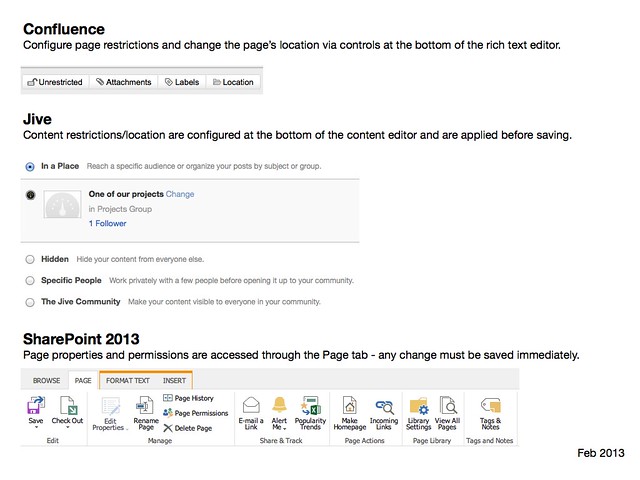
- In SharePoint 2013 the user must first navigate to the site and the "library" where they want to create content and then determine the name of the page before they can proceed further. Other page operations are logically organised for infrequent users - such as changing the page title or access restrictions - but require multiple (and sometimes complex) steps.
(Note: both Confluence and SharePoint let you create links in pages to pages that don't yet exist)
Again, its easy to jump to assumptions about which tool offers the best user experience.
In Confluence and Jive, the design of the user interface encourages users to create transient, rough work in progress or incidental content - for example, meeting notes could be quickly added while the meeting is taking place without worrying about where to save them.
The content creation process in SharePoint is more deliberate. It also probably takes into account that users are perhaps more likely to fire up Microsoft Word for note taking, rather than the intranet. In fact a SharePoint user could use SkyDrive Pro or a platform like Harmon.ie and not even interact through the Web browser at all.
Then again, if you looked at an enterprise microblogging platform like Yammer or Socialcast, then you would find that the user interface is optimised around status updates, not 'page' or 'wiki' content. And that's because they support an entirely different user experience again.
But a SharePoint add-on, such as Newsgator, can also completely change that user experience:
Which product has the best user experience? The one that has the user experience your users need.